

Between influencers touting the benefits of seasonal colour analysis, paint companies releasing annual colour forecasts, and AI programs churning out endless colour palettes at the click of a button, there’s never been more discourse surrounding the importance of colour. However, the best way to understand colour remains the same as it did over half a century ago. Namely, through Josef Albers’ Interaction of Colour.


First published in 1963, Interaction of Colour acts as a record of Albers’ experimental approach to studying colour. Until then, notions of colour were purely scientific, largely based on Isaac Newton’s discovery that clear white light was composed of seven visible colours, each blending into the next. By laying forth these colours in order, Newton created the first colour wheel in 1666.
For almost three centuries, studies of colour continued in a largely circular fashion. During the Bauhaus era, Swiss painter and theorist Johannes Itten further extrapolated upon the colour wheel, developing a colour star based around seven fundamental categories of contrast: hue, light-dark, cold-warm, complementary, analogous, saturation, and extension.
Meanwhile, Russian painter Wassily Kandinsky took a less rigid, more emotive approach, establishing emotional and spiritual associations between specific colours and forms. A noted synaesthete, with the ability to experience colours when listening to music, Kandinsky’s views on colour took on a passionate tone. In his book Concerning the Spiritual in Art, he notes: “Colour directly influences the soul. Colour is the keyboard, the eyes are the hammers, the soul is the piano with many strings.”
Albers and Kandinsky shared a close friendship that extended well beyond their time at the Bauhaus school of design. However, the former’s approach to colour diverged from Kandinsky’s belief in the inherent meaning—or “spiritual associations”—of each colour. Instead, Albers proposed the absolute relativity of colour.
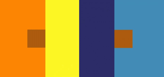
He theorised that “in order to use colour effectively it is necessary to recognize that color deceives continually.” To that end, he conducted a series of experimental activities during his time leading the visual arts program at North Carolina’s Black Mountain College. His course on colour comprised simple exercises which challenged students to play with colour combinations, exploring how the same colour can interact differently based on how it’s placed.

“It should be learned that one and the same colour evokes innumerable readings,” Albers notes in Interaction of Colour, which is the result of three decades of the study of colour and contains Albers’s introductions to the exercises accompanied by over two hundred colour comparison palettes, predominantly created by his students, along with Albers’ commentary on the palettes.
He proposed that colour cannot be studied in silo and that the assignation of certain attributes or emotions to a particular colour is arbitrary, as the relativity of colour requires contextualisation to be understood.
“Instead of mechanically applying or merely implying laws and rules of colour harmony, distinct colour effects are produced—through recognition of the interaction of colour—by making, for instance, two very different colours look alike, or nearly alike.”
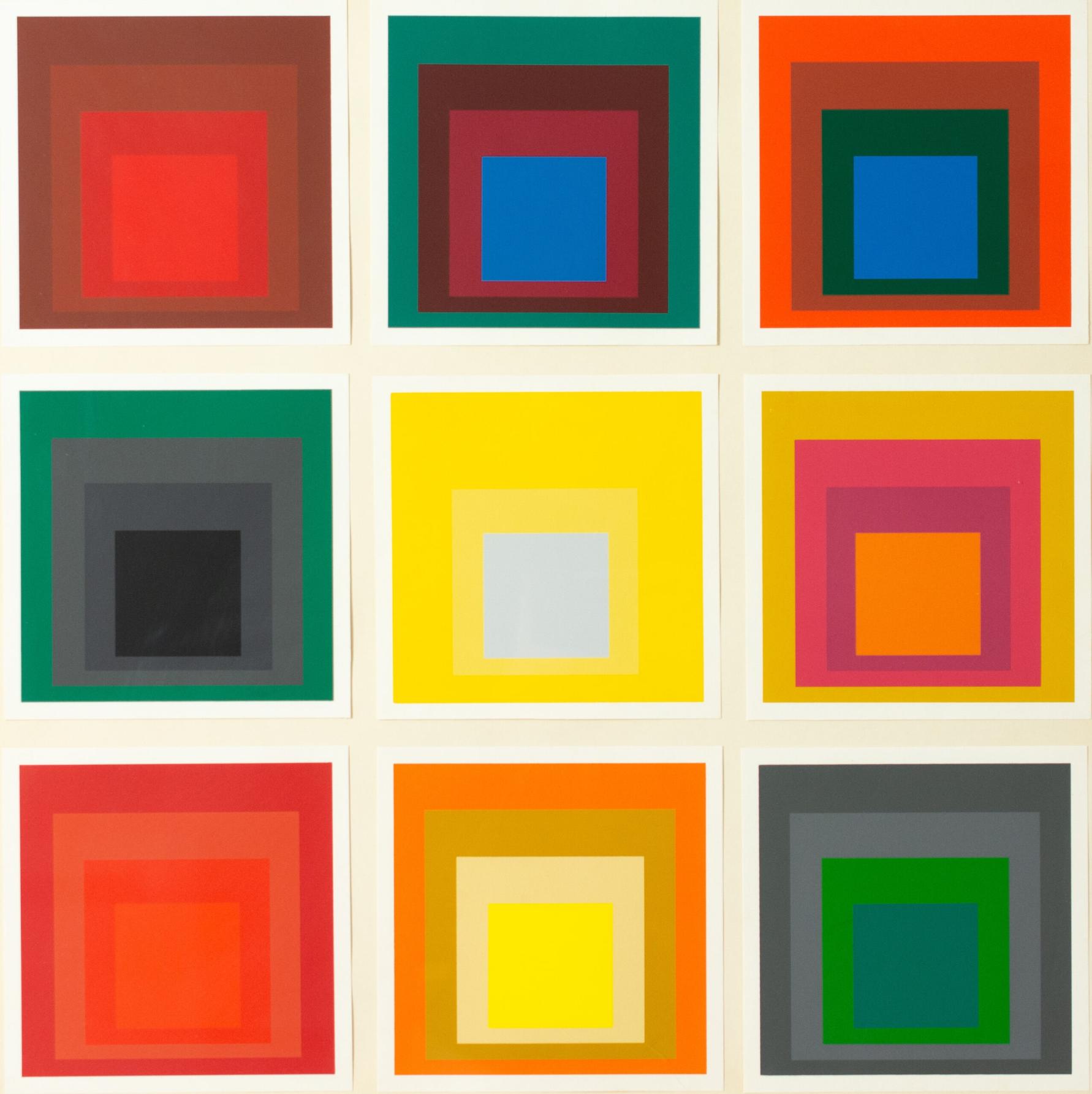
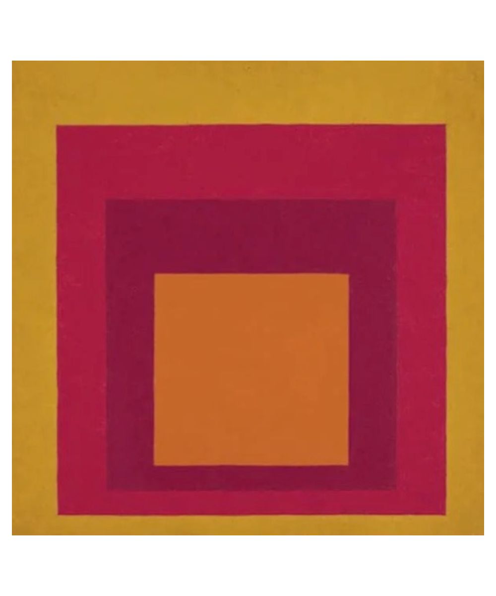
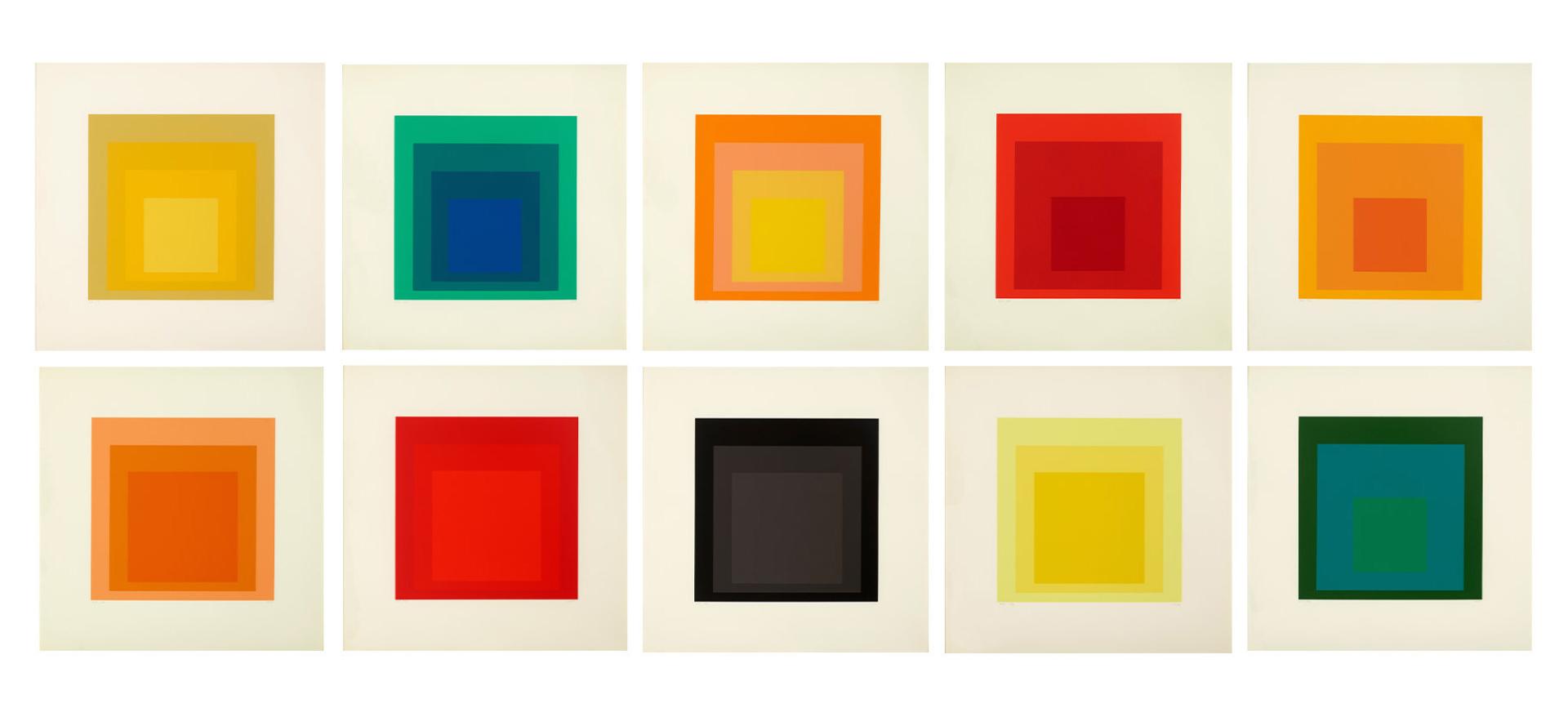
His seminal Homage to the Square (1950 – 1976) series is one of those deceptively simple “oh, I could have done that” works of art. Sure you could have, but you didn’t think to do so, did you?

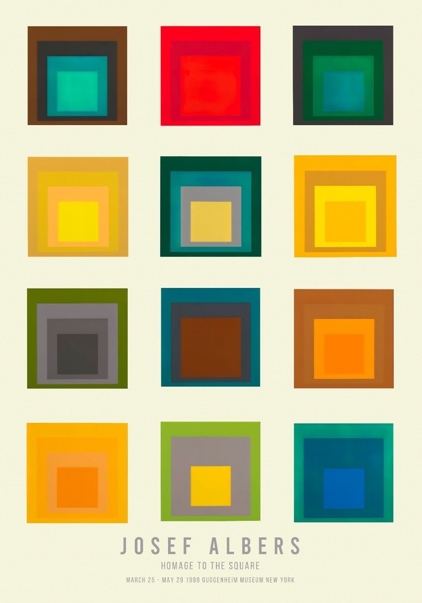
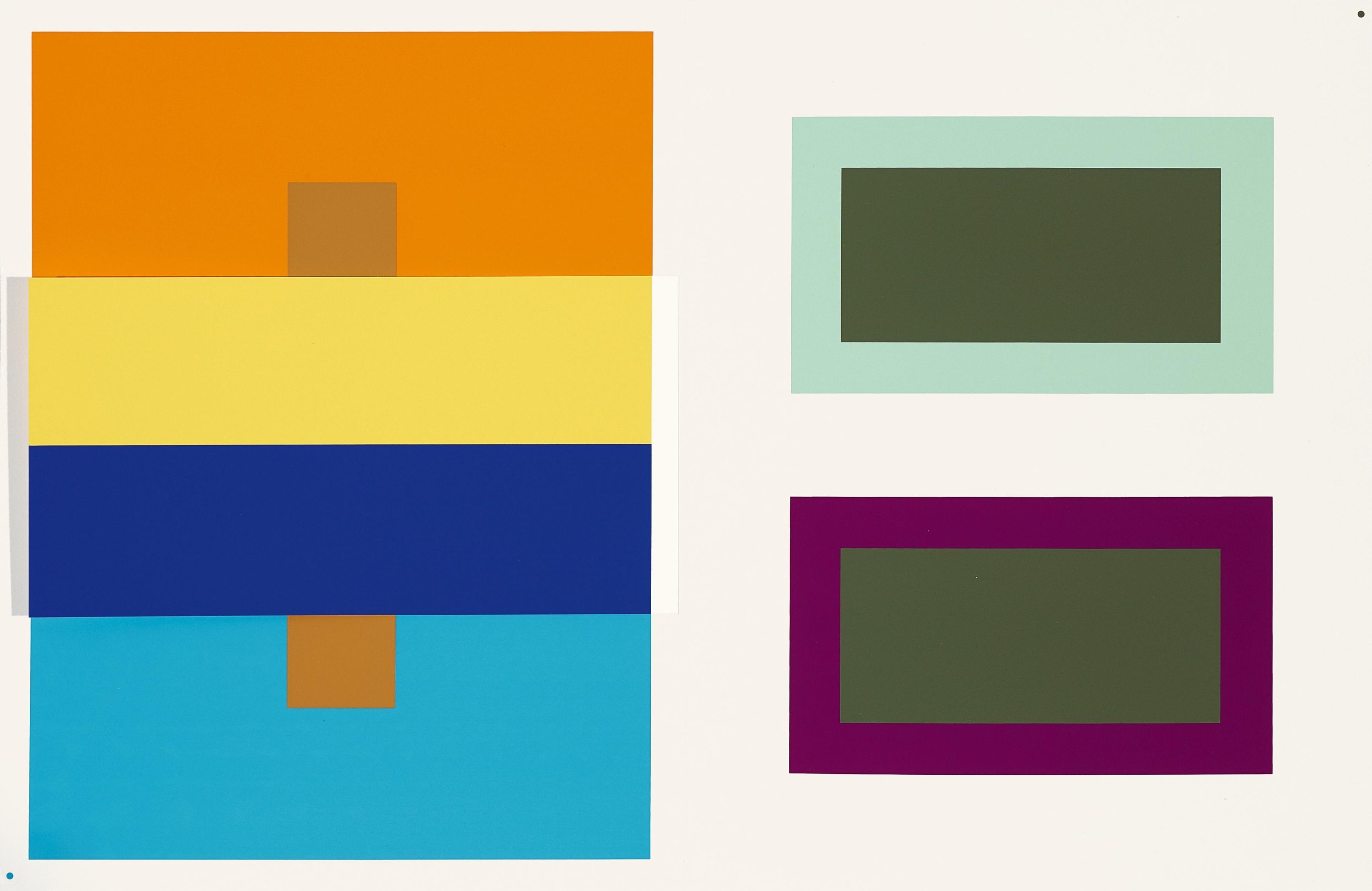
Comprising sets of squares—typically stacked atop each other—of colours in varying hues, saturation, and brightness, Homage to the Square showcases how complex colour can be, with their interaction with themselves and each other altering our perception of them. Here, idea is equally as important as execution, with Homage to the Square visually depicting how colour is in a constant state of flux and therefore can only be understood in relation to the colours that surround them.
For example, a green square may appear darker when placed next to an orange square, but lighter when paired with a brown or black square. In the same vein, yellow may be thought of as a warm colour, but placing it next to shades of pale blue, white, and grey gives off a completely different energy than teaming it with green and orange.
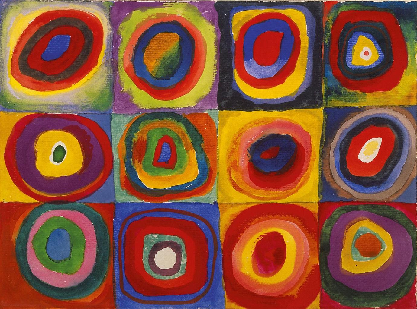
The essentialist nature of each geometric painting in Homage to the Square allows each palette to be studied for what it is, free from distraction by way of complex shapes and forms. Contrast them with Wassily Kandinsky’s rather spirited colour study, Squares with Concentric Circles (1913), which gives viewers a glimpse into how the Russian painter used colour in his creative process.
A rejection of dogmatic colour systems and theory, Josef Albers’ work is an ode to the relativity of colour — and, the power of perception.
Words by Theo Rosen